
If you ever asked yourself one of the following questions, just keep reading:
❓ (1) How do you get icons for your PowerPoint presentation?
❓ (2) Where can you get free icons for PowerPoint?
❓ (3) Is there an icon library in PowerPoint that you can use?
❓ (4) How do you make your icons look professional in PowerPoint?
All these questions I answer in my YouTube video 🎬 – and in this article. Let’s start with the first one.
1) How do you get icons for your PowerPoint presentation?
You might have seen this before: A colleague shows a really cool presentation. On the slides you notice these fancy icons.
The icons do not only look great, they perfectly match the content, too. They make the slides just looks very special and professional.
Icons are these amazing little visuals that brush up your presentation.
And they can do more great things:
- Icons can provide a structure
- Icons can direct the viewer’s attention to most relevant points
- Icons can highlight your arguments visually
- Icons can even trigger a smile 😊
Sometimes icons are also called symbols, app icons, or pictograms. And we all know them from our phones.
Let’s say you talk about new ideas on your PowerPoint slide. You could add the icon of a light bulb to emphasize what your slide is about. 💡
You talk about numbers on the decline. You could add the symbol of a banana peel if you want to give it a funny touch. 🍌
You might talk about the strength of a product. You could use the logo of a dump bell to underline it, or a strong bizeps. 💪
You probably get the idea.
But you need to know how to use them correctly. Otherwise, they can look untidy.
And, of course, you need to know where to get them from.
2) Where can you get free icons for PowerPoint?
Is it true that you can get these icons for free?
Yes, it is!
There are two ways to get free icons for your presentation.
It’s important to mention that you need to use icons that are not or protected by copyright or another type of license. But the good news is that there are plenty of them available.
The first way are external websites.
A good way to find them is to google “license free icons”. You will find plenty of pages. For some you need to create an account, for others not. I personally like the websites flaticon or iconfu (all links in this article are non-affiliate links).
As an example, let’s have a look at flaticon. It is a huge icon database and it offers plenty of free icons. If we are looking for a banana peel, we can type ‘banana, and we get many results. They all vary in style and you can find one that matches your presentation visually. When you download the icon for free, flaticon shows you how to attribute the creator.
As another example, iconfu is a much smaller database. But what I like about it is the very high degree of customization. This means you can change the look and color of the icon to what you want it to be. That can be useful if you have specific corporate colors and you want an icon to match them.
Alright, now we know that we can get icons from external websites. But …
3) Is there an icon library in PowerPoint that you can use?
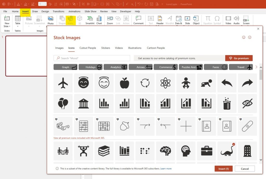
The second way to get license free icons is PowerPoint’s own icon library.
If you are using Microsoft Office 2021 or Microsoft Office 365, this feature is available to you.
It’s the easiest way to get great icons for your presentation.
In PowerPoint, simply go to Insert > Icons. The icon library opens and you can browse the icon database. Scroll through the icons or jump to one of the categories on top. If you are looking for something specific, you can type in a search term – such as a light bulb as a symbol for ideas. Then, select the icon you like and click ‘Insert’.
Alright, now we know two sources where we can get the icons from.
Next, let me show you how to make them look professional.
As I mentioned before, you can save a lot of time when building your presentation – if you know how to use shortcuts in PowerPoint. This is why I recommend my FREE PowerPoint Cheat Sheet with the most important shortcuts (click here to get it).
4) How do you make your icons look professional?
Now, let me show you two styles to make your icons shine.
The first style I call the ‘Apple style’.
Do you remember when Steve Jobs introduced the iPhone to the world? That was pretty much the time when the app icons appeared. They are these catchy little graphics inside a square with rounded corners. That’s why I call this style the ‘Apple style.’
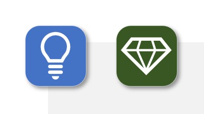
To make an Apple style icon, follow these steps (as shown in the video here). In this case, we are looking for something to represent ‘Ideas’ and ‘Values’.
- We go to the icon library.
- For ideas, we type ‘light bulb’ and select the icon that we like.
- For values, we type ‘diamond’, select the icon, and click Insert.
- We add a rectangle with rounded corners and make it square. I use 2 cm for width and height in this example.
- We can also adjust the rounded corners and pick a fill color that we like.
- We give the box a very slim outline in a light color, in this case a light gray.
- And we add a simple drop shadow.
- Then we bring the actual graphic to the front and resize it to match the square.
- Now we select both objects and center them horizontally and vertically.
- We also change the color to white to get a better contrast.
And that’s it – your pretty little icon for ‘Ideas’ is ready.
We do the same for the ‘Values’ icon.
- To copy the rounded square, we press Ctrl + Shift and drag and drop it with our mouse.
- We change the fill color to one that we like.
- We bring the actual graphic to the front and resize it to match the square.
- We select both and center them horizontally and vertically.
And that’s it – our Apple-styled icons are ready.
The second style I call the ‘coin style’. It is similar to the first style (as shown in the video here). The only difference is that the icon is shown in a circle instead of a square. The icons look like a coin, that’s why it the ‘coin style’.

To make a coin style icon, we can repeat the same steps as before – just with an oval shape.
Or in this case, we can build them even quicker if we just change the shape of our first icons.
- We copy and paste them.
- We select the square, go to Shape Format > Edit Shape > Change Shape and select the oval.
- For the second icon, we select the object, grab the yellow dot, and turn the square into a circle.
And here we go, that’s our coin-styled icons.
That’s all you need to know about icons for today. Now you can create your own pretty ones.
And don’t forget to read my next article if you want to build better presentations faster.